The Best Image Format for Website Speed in 2026
Images are almost always the largest single share of a web page's weight, which makes them the first place to look when you want a faster site. And speed is not just a nicety — Google uses Core Web Vitals, especially Largest Contentful Paint, as a ranking signal. Pick the right image format and you can cut page weight dramatically without touching a line of layout code. This guide breaks down which format wins in 2026, backed by a real-world speed test, and shows exactly how to implement it.
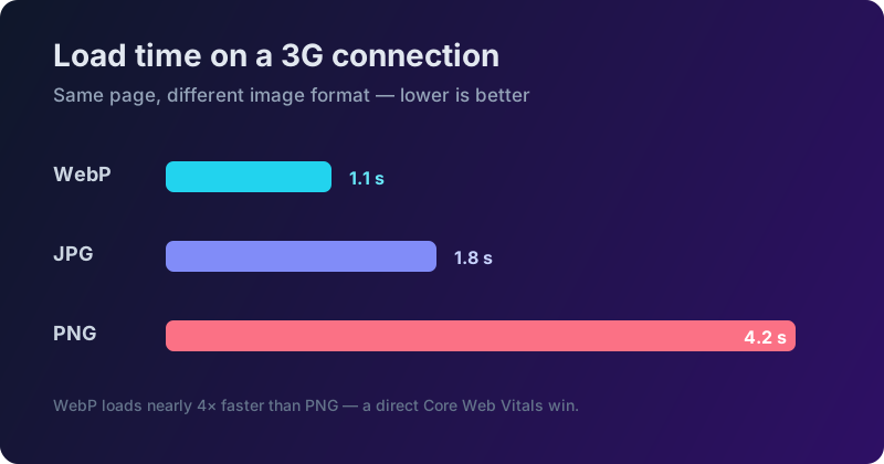 Image format is the #1 factor in page load speed.
Everything below runs through our converter locally in your browser, so you can convert your whole library privately without uploading anything.
Why image weight matters more than you think
It is easy to treat image size as a technical footnote, but it has real business consequences. Studies of large e-commerce sites have repeatedly found that every additional second of load time measurably reduces conversions, and that a large fraction of visitors abandon a page that takes more than three seconds to become usable. On mobile networks — where a big share of traffic now lives — those extra megabytes translate directly into spinning placeholders and lost visitors.
Images sit at the centre of this because, on a typical page, they account for more of the transferred bytes than HTML, CSS and JavaScript combined. Largest Contentful Paint, one of the three Core Web Vitals, usually measures the moment the biggest image or text block finishes rendering — and on most pages that biggest element is an image. Shrink the hero image and you often improve your single most important speed metric with one change. That is why format choice is not a micro-optimisation; it is frequently the highest-impact performance work available to you.
Real-world speed test: same photo, four formats
To make this concrete, take one identical 1920 × 1080 photograph and export it four ways at visually matched quality, then load each on a throttled 3G connection. The results are consistent with what you will see on almost any photographic image:
- PNG — 2.4 MB, about 4.2 seconds to load. Lossless, and far too heavy for a photograph.
- JPG — 180 KB, about 1.8 seconds. The reliable, universal baseline.
- WebP — 120 KB, about 1.1 seconds. Roughly 33% smaller than the JPG, and visually identical.
- AVIF — 89 KB, about 0.9 seconds. The smallest of the four, at the cost of slower encoding.
The takeaway is stark: the PNG version takes almost four times as long to load as the WebP one, for a photo the eye cannot tell apart. Swapping formats is free performance. You can convert existing files with tools like WebP to JPG or PNG to WebP depending on which direction you need.
The contenders
AVIF — smallest files
Built on the AV1 video codec, AVIF typically produces files up to 50% smaller than JPG at the same quality, with excellent colour depth and transparency support.
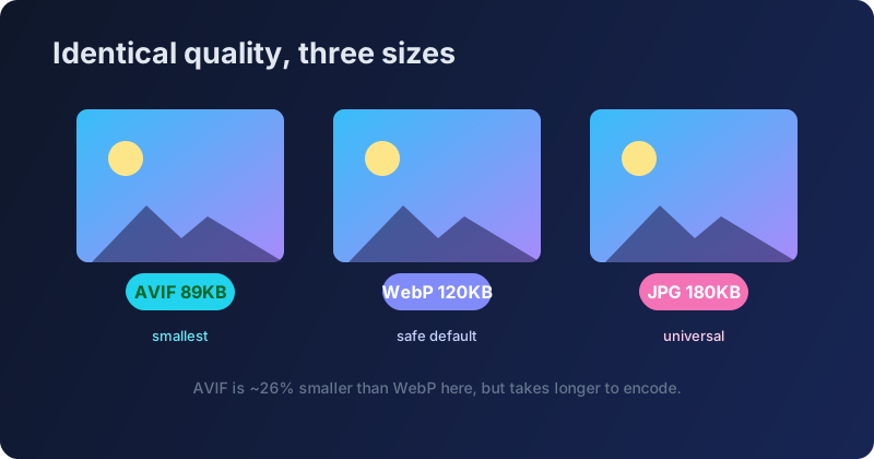 AVIF is 26% smaller than WebP, but encoding takes longer.
Its one drawback is encoding time — AVIF takes noticeably longer to compress, which matters if you are processing thousands of images in a build pipeline. For a typical website, though, that cost is paid once and every visitor benefits.
WebP — the safe modern default
WebP sits slightly above AVIF in size but encodes quickly and has been battle-tested for years. It is roughly 30% smaller than JPG, supports both lossy and lossless modes, and is now supported by every major browser.
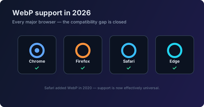 Every modern browser supports WebP. The compatibility gap is closed.
For most teams WebP is the pragmatic choice: nearly the compression of AVIF, a fraction of the encoding time, and universal browser support.
JPG and PNG — the classics
JPG remains the perfect fallback for maximum compatibility and photographic content. PNG should be reserved for graphics — logos, icons, screenshots and anything needing transparency or crisp text. If you need transparency but want something lighter than PNG, reach for WebP, which supports an alpha channel at a fraction of PNG's size.
When NOT to use WebP
WebP is excellent, but it is not always the right call. There are a few situations where reaching for JPG (or PNG) is smarter:
- Email. Many email clients — including some versions of Outlook and a number of corporate webmail systems — still do not render WebP. For newsletters and transactional email, stick to JPG or PNG so every recipient sees your images.
- Legacy CMS and plugins. Some older content management systems, themes and upload widgets reject or mishandle WebP files. If you cannot control the rendering environment, a JPG will always display.
- Absolute universal compatibility. If an image absolutely must open on any device, any app, any decade-old browser — a product label, a downloadable asset, a print-ready file — JPG wins on ubiquity alone.
The pattern is simple: use WebP and AVIF where you control the page, and fall back to JPG where you do not.
Format decision flowchart
When you are unsure, three questions settle it almost every time.
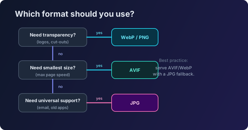 Follow this flowchart to pick the right format every time.
Do you need transparency? Then WebP (or PNG for graphics). Do you need the absolute smallest file for maximum speed? Then AVIF. Do you need it to open universally, including in email and legacy apps? Then JPG. For everything else, WebP is the balanced default.
Developer implementation guide
Knowing the best format is only half the job — you also need to serve it with a graceful fallback so older clients still get an image. Here are the three most common ways to do that.
The HTML <picture> element. This is the native, framework-free approach. The browser walks the sources top to bottom and uses the first format it supports:
<picture>
  <source srcset="hero.avif" type="image/avif">
  <source srcset="hero.webp" type="image/webp">
  <img src="hero.jpg" alt="Hero image" loading="lazy" width="1200" height="630">
</picture>
Next.js. The built-in next/image component negotiates modern formats automatically and generates responsive sizes, so you usually just point it at a source image and let it emit WebP or AVIF. (This very site is a static Next.js export.)
WordPress. Plugins such as ShortPixel or Imagify convert your media library to WebP/AVIF on upload and serve the right format per browser, with no manual work per image.
Whichever route you take, always include width and height (or an aspect ratio) and loading="lazy" for below-the-fold images to prevent layout shift and defer off-screen downloads. The same principles apply to every image on your site, from the hero banner to the smallest icon.
Responsive images: format is only half the story
Choosing WebP or AVIF fixes the format, but you can go further by also serving the right size to each device. A phone with a 400-pixel-wide screen has no use for a 1920-pixel image — sending one wastes bandwidth and slows the page for exactly the users on the slowest connections.
The srcset and sizes attributes let the browser choose an appropriately sized file from a set you provide:
<img
  src="photo-800.webp"
  srcset="photo-400.webp 400w, photo-800.webp 800w, photo-1600.webp 1600w"
  sizes="(max-width: 600px) 100vw, 800px"
  alt="Product photo" loading="lazy" width="800" height="600">
Now a mobile visitor downloads the 400-pixel version and a desktop visitor gets the sharp 1600-pixel one, all from a single tag. Combine responsive sizes with a modern format and a JPG fallback, and you have covered every visitor with the smallest file that still looks great on their screen. To generate the different sizes, resize images to each width first, then convert the set to WebP.
A quick word on what not to do: never upscale a small image to fill a large slot (it just looks soft and wastes bytes), never ship a PNG screenshot where a WebP would do, and never forget the alt text — it is essential for accessibility and gives search engines context about the image.
Core Web Vitals impact
The payoff for all of this shows up directly in your Lighthouse score. Because images dominate Largest Contentful Paint, switching a heavy PNG hero to WebP or AVIF often moves the needle more than any other single change.
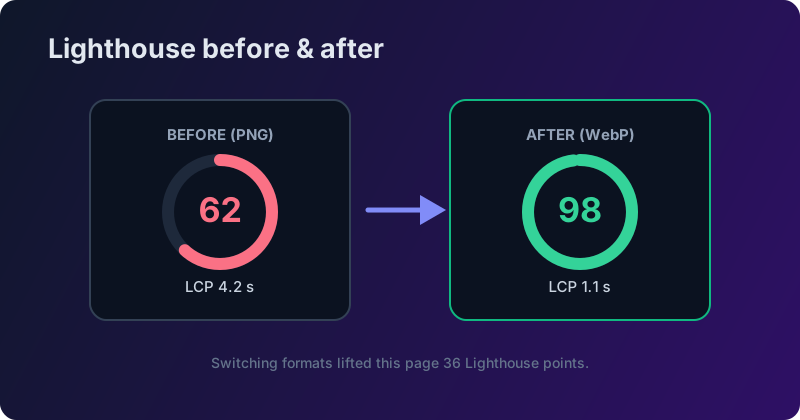 Switching formats can boost your Lighthouse score by 30+ points.
In the example above, converting the page's images lifts LCP from 4.2 seconds to 1.1 seconds and the performance score from 62 to 98 — a 36-point jump from a change that took minutes. That is the kind of improvement that moves rankings.
Getting the quality setting right
Format is the big lever, but the quality setting is the fine adjustment, and it is worth understanding. Quality in JPG, WebP and AVIF is a number, usually from 1 to 100, that controls how aggressively detail is discarded. Counter-intuitively, the top of that range is wasteful: the jump from 95 to 100 can double a file's size for a difference no human can see. For photographs, the sweet spot is almost always somewhere between 75 and 85 — small files, no visible artifacts.
The exception is images with sharp edges and text, like screenshots or graphics with fine lines. Lossy compression smears those edges, so either keep the quality higher or use a lossless format for that specific asset. When in doubt, export at a couple of quality levels, view them at 100% zoom, and pick the lowest setting where you cannot tell the difference. Rather than guessing, you can also let an exact-size compressor find the optimal quality for a target file size automatically — the same technique that makes hitting a hard size budget effortless.
Beyond photos: icons, logos and animation
Everything so far has been about photographs, but a real page has other image types too, and the best format changes for each. For logos, icons and simple illustrations, the winner is usually SVG — a vector format that stays razor-sharp at any size and is often just a few kilobytes. Because SVG is code rather than pixels, it scales from a tiny favicon to a full-screen hero without ever getting blurry or heavier, which is why interface icons should almost never be shipped as PNG.
For animation, skip the animated GIF. GIFs are enormous, capped at 256 colours, and look dated; a short muted MP4 or WebM video is typically ten times smaller at far higher quality. If you have a legacy animated GIF sitting in a hero slot, converting the motion to a looping <video> tag is one of the biggest single savings available on many pages.
The rule of thumb is worth memorising: photographs become WebP or AVIF; logos and icons become SVG; animation becomes video, not GIF; and PNG is reserved for the rare case where you genuinely need lossless raster with transparency. Match the format to the type of image and you rarely go wrong.
How to measure your own images
You do not have to guess whether images are slowing your site — the browser tells you directly. Open DevTools → Network, filter to Img, and reload the page: you will see every image, the number of bytes actually transferred, and how long each one took. Sort by size and the offenders jump straight to the top of the list.
For a fuller picture, run a Lighthouse audit (built into Chrome under the Lighthouse tab). It flags oversized images, missing width and height attributes, and images that should be lazy-loaded — and it estimates the seconds you would save by fixing each one. The MDN guide to responsive images is an excellent reference once you start acting on those findings, and a free tool like WebPageTest will show you the same numbers on real devices and connection speeds if you want to see what a visitor in the field actually experiences.
The workflow is a short, reliable loop: measure, convert the heaviest offenders to a modern format, resize any image that is larger than the space it fills, then re-test to confirm the win. Repeat until nothing on the page stands out. It rarely takes more than a single focused session, and it is almost always the cheapest performance work you will do all quarter — no new framework, no infrastructure, just lighter files that turn a sluggish site into a fast one.
Convert your library in minutes
You do not need a build pipeline to get started. With our converter you can batch convert a whole folder of JPGs and PNGs to WebP or AVIF at once, entirely in your browser, and download them as a ZIP. Everything stays private because nothing is uploaded. Ship lighter images, pass Core Web Vitals, and climb the rankings.